When you purchase through links in our articles, Future and its syndication partners may receive a commission.

Photo credit: Westchester County
When a local government agency introduces a new logo, we expect a strong opinion from residents, but this redesign for Westchester County, New York is drawing criticism for a surprising reason. Some people think they've discovered an unfortunate similarity to a completely different brand.
There are three new designs in total, all of which are overshadowed for different reasons. The old logo was hardly exciting, but the state government probably wasn't expecting the new design to be compared to a dating app (see our guide to designing a logo for tips on your own).

Westchester County logo
Westchester County was in dire need of a rebrand because its old logo clearly displayed the county's “.com” domain, which would now be changed to “.gov.” The result is a fleet of three new logos that, although sensibly foregoing any reference to a domain name, are met with criticism for other reasons.
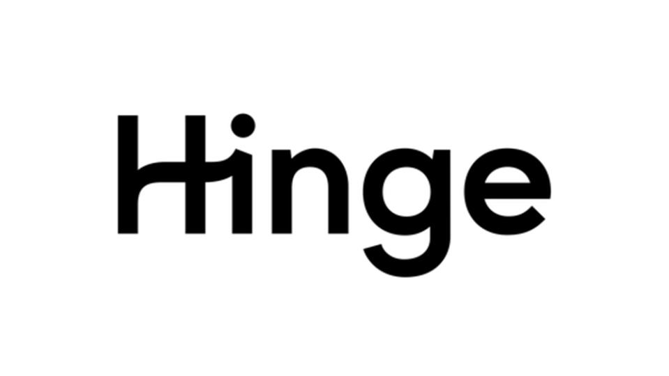
Authorities say the designs are intended to symbolize the county's “connected community and its enduring commitment to innovation, natural beauty and shared progress.” However, some people believe that the squiggle for the crossbar on the “H” was taken directly from the dating app Hinge.

Hinge logo
Aside from the crossbar, the color palette of the new logo seems very boring for a dating app. “Screaming 'Westchester is boring and boring,'” one person wrote on Facebook. “It's a bad logo that's already outdated before it hits the market,” wrote graphic designer Marcy Rauch, while someone else said it looks “80s/90s, but not in a fun way.” ” Over on Instagram, someone says it “looks like the logo of an outdated cheap motel.”
Things don't get any better with the two abbreviated logos that use the acronym WCNY. “It looks like a radio station logo from the early 90s,” one person wrote. In fact, it turns out that there is a PBS station called WCNY that apparently has a good bluegrass show on Sunday nights.

Westchester County logo
Westchester County Executive George Latimer has explained that the crossbar on the “H” in the new logo is intended to represent a hook, symbolizing the fact that residents are “connected by rail, road and air. Through culture. And most importantly, through selection.” The color palette uses “Columbia Blue” to represent history, “Dark Green” to represent the environment, and “Indigo Dye” to represent the county's waterways.
A logo redesign is always going to draw some negative reaction, and the reaction in Westchester pales in comparison to the backlash that greeted the new Visalia logo earlier this year (see also our roundup of the best and worst logos of 2024).
