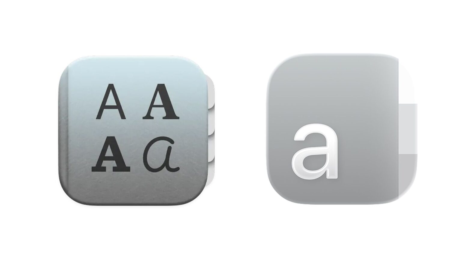
The emergence of Apple's Liquid Glass design language has proven to be one of the most controversial UI developments in recent years – and perhaps the most significant since iOS 7's transition from skeuomorphism to flat design in 2013.
Liquid Glass has brought sweeping changes to icon designs across Apple's software lineup, including macOS and iOS. And while it's the larger questions of accessibility and aesthetics that have angered most dissenting voices, one symbol is of particular concern to graphic designers.
Is anyone else disappointed with Apple's Fontbook icon redesign? from r/graphic_design
The icon of Font Book, macOS's built-in font manager, has been significantly simplified. Gone are the various fonts in which the letter “A” has been replaced with a single, clean sans serif character.
Many have complained that it is no longer clear what the app does. “I understand the modern interpretation but this is disappointing, I'd rather have 'Aa' than just 'a',” one Reddit user commented. Another added: “Hmmm yeah, that's annoying.”
Nobody told me Font Book got the icon downgrade of the century pic.twitter.com/423vNYsIjlNovember 7, 2025
But not everyone hates the clean design. “Although the old app did a better job of communicating the app's purpose and identity, I think the new one is much prettier. Overall, I'd say they're both good in different ways,” commented another user.
For our money, the cleaner design isn't necessarily a downgrade and is definitely in line with Liquid Glass's aesthetic. But Apple design is arguably at its best when it's fun – and this is another small but disappointing departure from the colorful Apple of the noughties.
