We may generate income from the products available on this site and participate in affiliate programs.
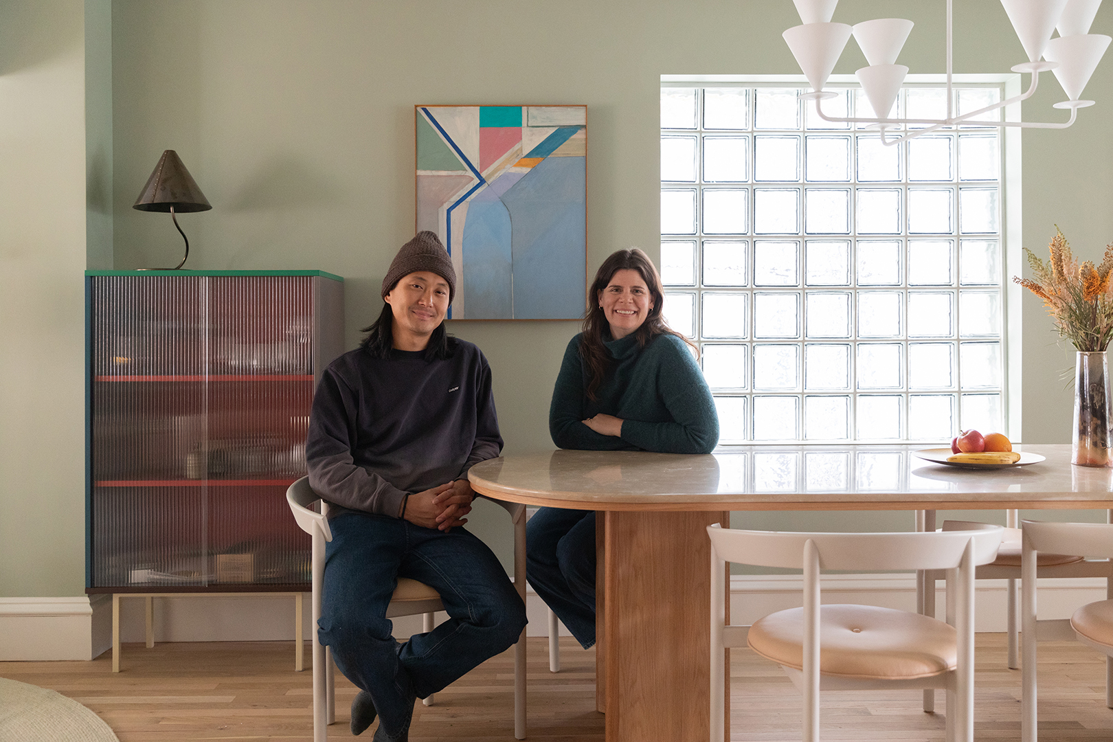
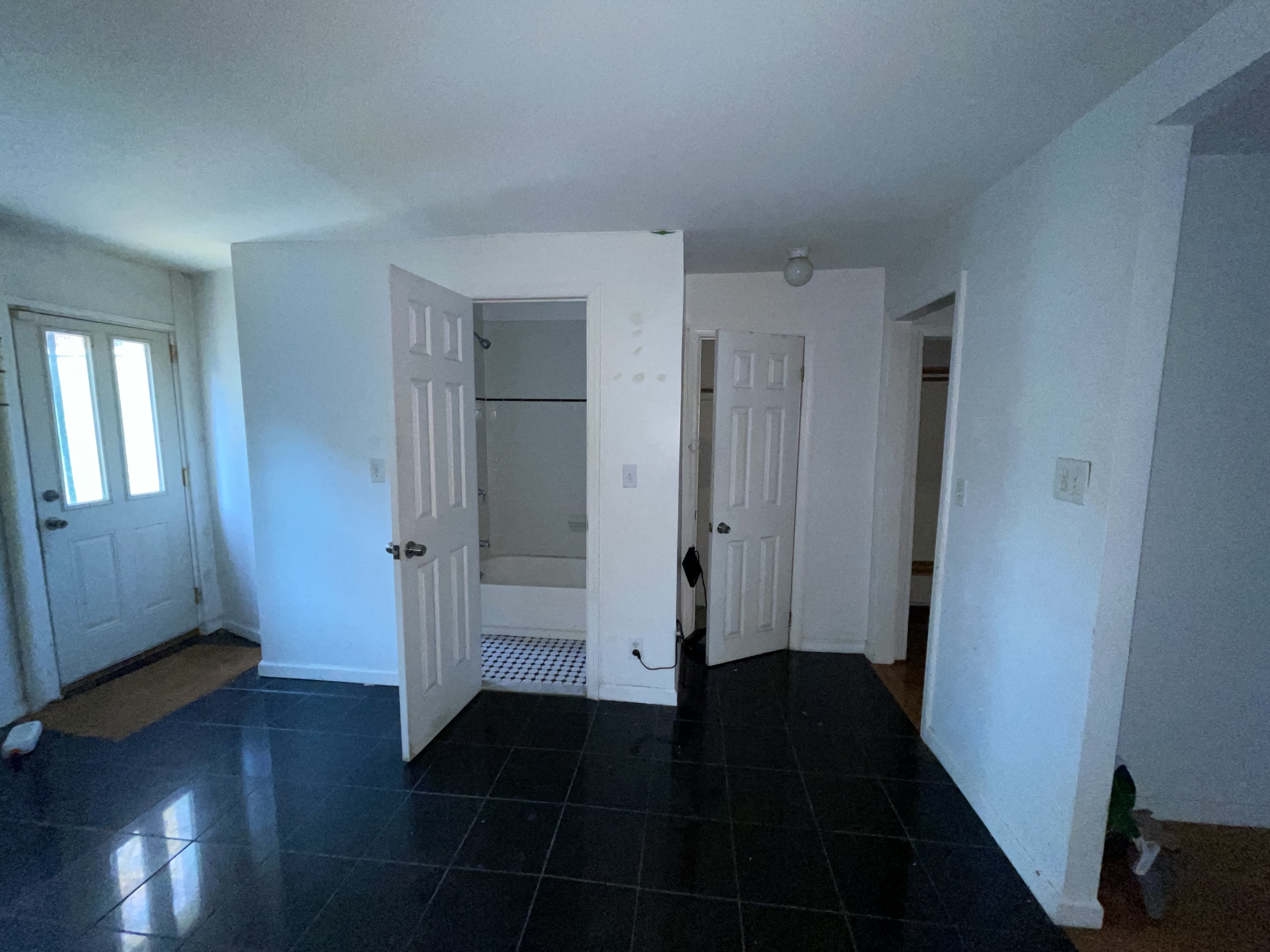
When Kemper Neill-Chung first saw this townhouse in Bed-Stuy, Brooklyn, it looked like “just the right amount of work,” she says. After just a month of casually scouting locations, she and her husband, Tim Neill-Chung, settled on the three-story home. But what they thought would be an easy renovation (“kitchen and bathrooms only”) quickly turned into a two-year gut job that required the help of structural engineer Michael Dunham and architect Rachel Robinson of Dunham Robinson. Together, the pair transformed the bottom two floors into a three-bedroom, two-and-a-half bathroom home for the couple and their now five-month-old son, as well as an additional upper floor for renters and visiting family.
“That was our dream,” says Tim, “to buy this kind of townhouse, then renovate it, live in it and raise a family here.” Read on to find out how they did it.
The window workaround

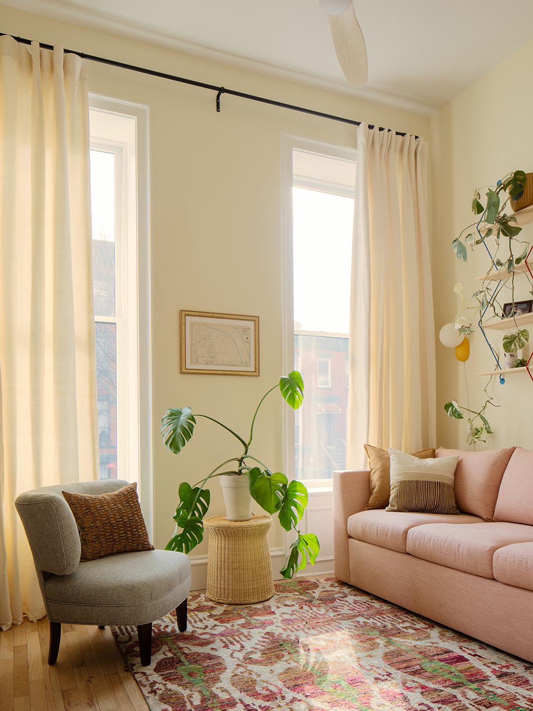
At the top of Kemper and Tim's renovation priority: adding as much light as possible. A selling point for the property was that it is not located between other houses – the house sits on a plot next to an access road, meaning it receives natural light from all sides. But the window on the side of the house was “one of many things” that wasn't up to code, according to its designers. Rachel and Michael's solution? Special glass blocks with a fireproof glaze – technically this is a wall, not a window.
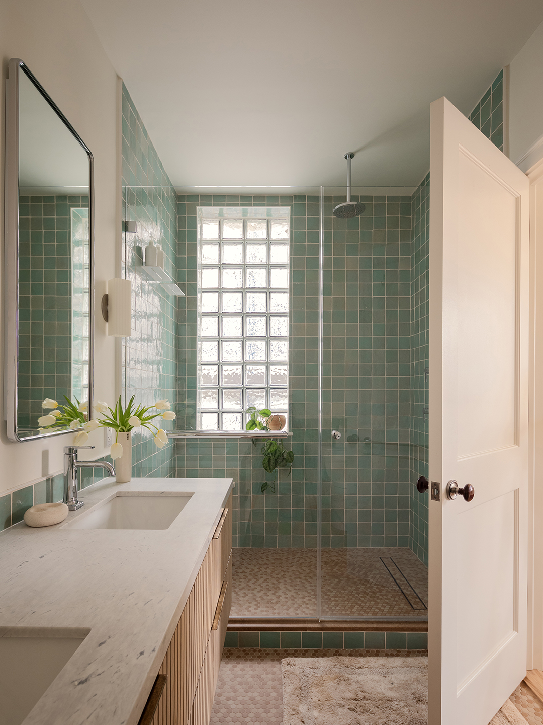
Kemper was there while Tim did some convincing (he thought it was “retro, but kind of old-fashioned”). Luckily, he became so comfortable with the solution that they made the opening even larger and then installed glass blocks in the living room and master bathroom, solving what Rachel calls “the dark hole problem in the middle of the townhouse.”
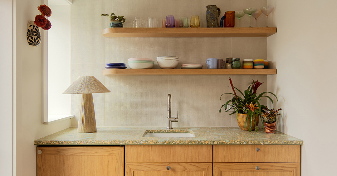
The groovy terrazzo


The second most important design element: terrazzo counters. Rachel is a long-time fan of the material and when Kemper saw these particular Concrete Collaborative records he was “completely obsessed.” The original plan was to use them on the kitchen floor, but the price was too high. Luckily, the countertop square footage fit their budget, so the soft green and honey-flecked slabs still found a place. From then on, they introduced reform cabinets in a complementary natural oak finish and quieter elements like the subtly dimpled back wall tile.


Tim's dream of a fully equipped kitchen came true, with a second prep room off to the side (formerly a bathroom) and a layout open to the rest of the home for entertaining. The couple cooks every day and embraces the space as the place where everyone naturally gathers at parties.
The garden-inspired powder room
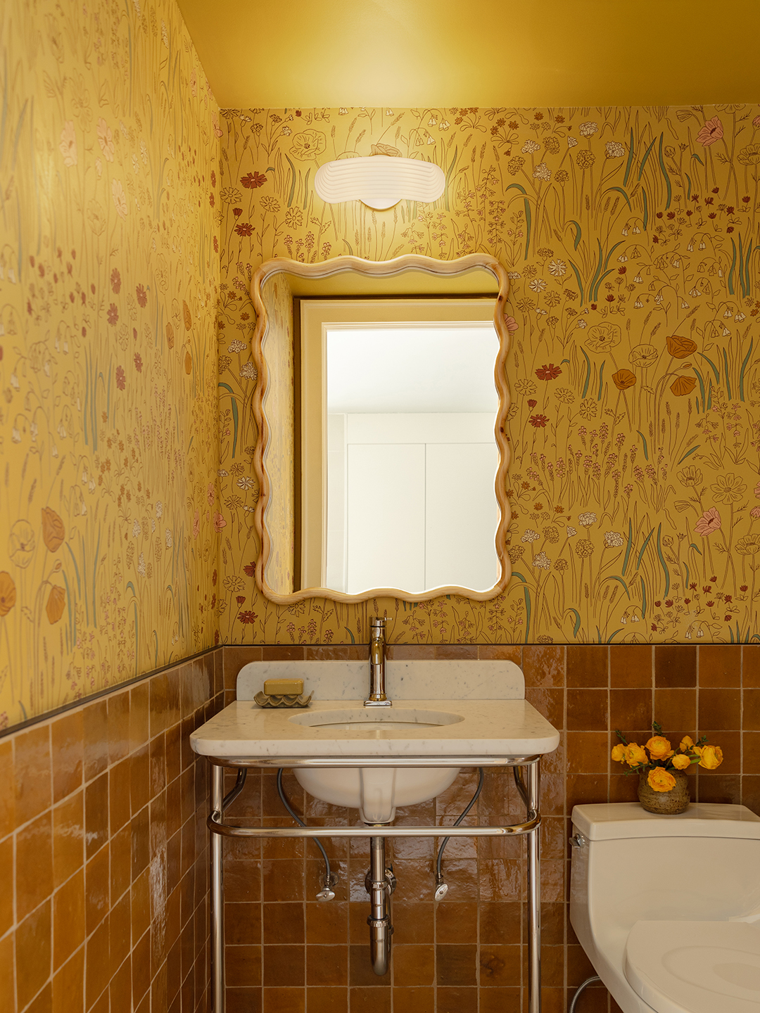
“We really worked to give this space an unusual, vibrant, playful and bright feel, all within traditional townhouse architecture,” says Rachel. Nowhere is this more true than in the garden level powder room. What is now the crown jewel of the space was once a full bath that jutted awkwardly into the area (downsizing allowed the designers to accommodate the laundry room and prep nook). The designers made a point of painting the ceilings an ocher tone that matched the Schoolhouse garden-inspired wallpaper and amber Zellige tiles.
The enchanting blanket
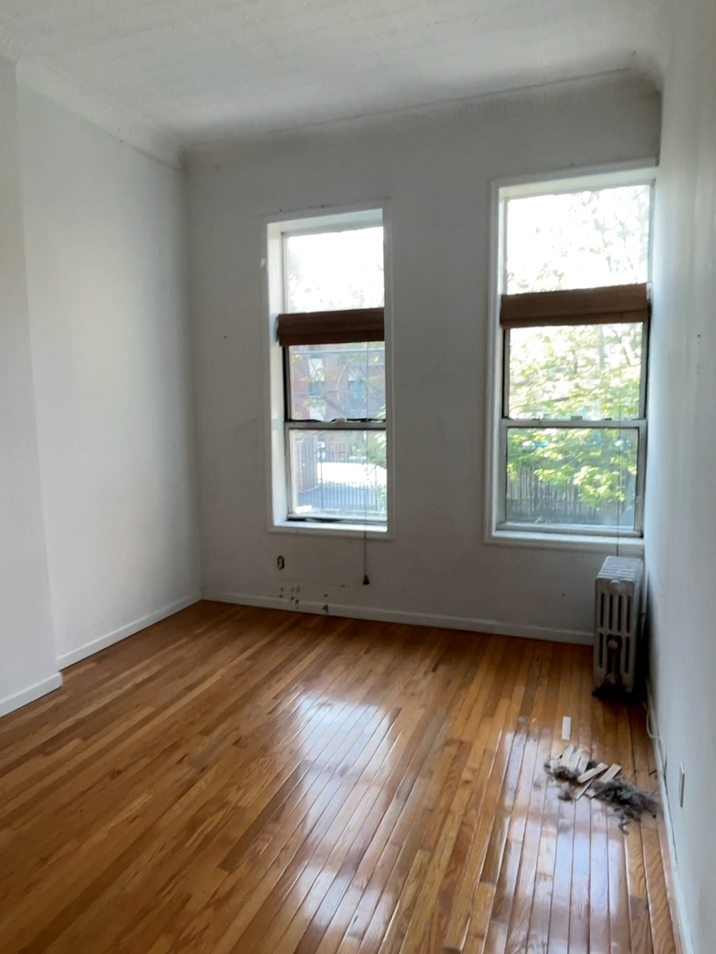
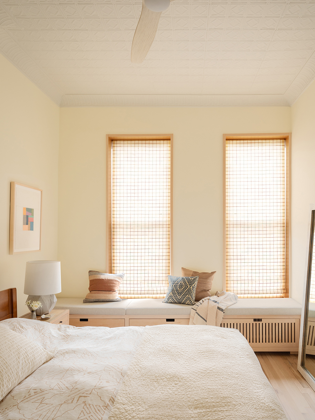
As the construction process began, it became increasingly clear that this project would be a study in balance. The original oak floors have been preserved and refinished and the moldings have been removed and restored. “It was covered up for a long time,” says Rachel. “So we didn’t even know what it would look like underneath until this process was underway.” They also retained the original tin ceiling in the bedroom, which contrasted delightfully with the elegant glass blocks and terrazzo counters they added.
The warm welcome home

There is a first time for everything. For the homeowners, that meant owning a washer and dryer and having a dedicated space for a dining table (you can't get more New York than that). For the designers? Creating a curved door was definitely a first. The idea was to visually soften the separation between the couple's space on the salon level and the stairs leading to the rental unit. However, they are no strangers to habits – so they became a team and designed furniture like the dining table in the shape of a race track. “It’s people’s biggest compliment when they come to our house,” says Kemper.


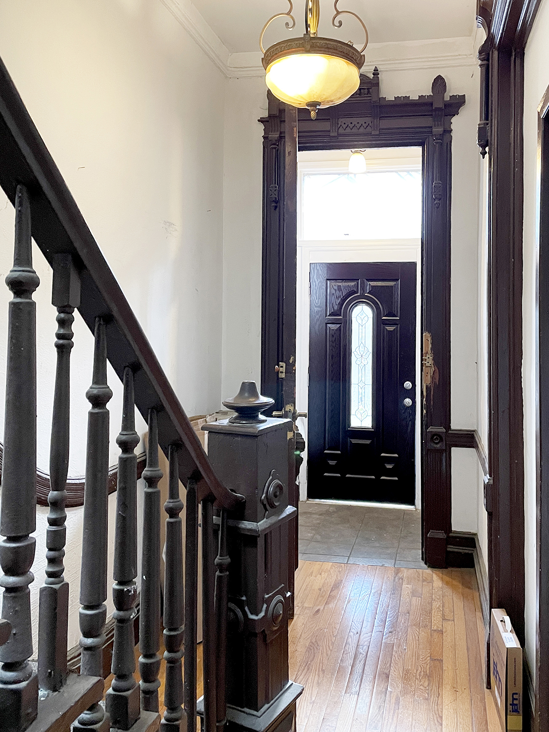
Each room has its own individual moment. All radiators are clad in woodwork and the window treatments in the master bedroom feature a subtle nod to each color in the home's color palette. Michael's favorite view is the entryway, which has gone from dreary to packed with storage (the built-in bench is equipped with deep drawers) and light (thanks to a glass door).
The answer to the atmosphere

There's no question that natural light is maximized in every room of the home. But what happens when the sun goes down? Perfectly positioned wall lights, ornate recessed lights and sculptural table lamps. Instead of harsh overhead lights, there are several ways to create more soft light within reach, providing flexibility throughout the day. It's a small but important design detail that inspires a lot of love from homeowners and designers alike.
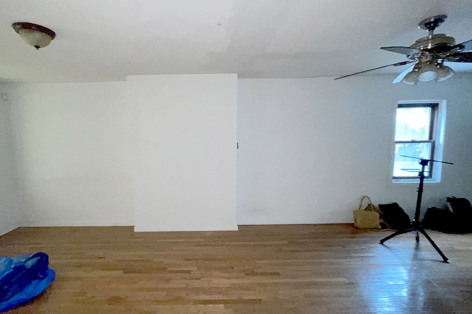
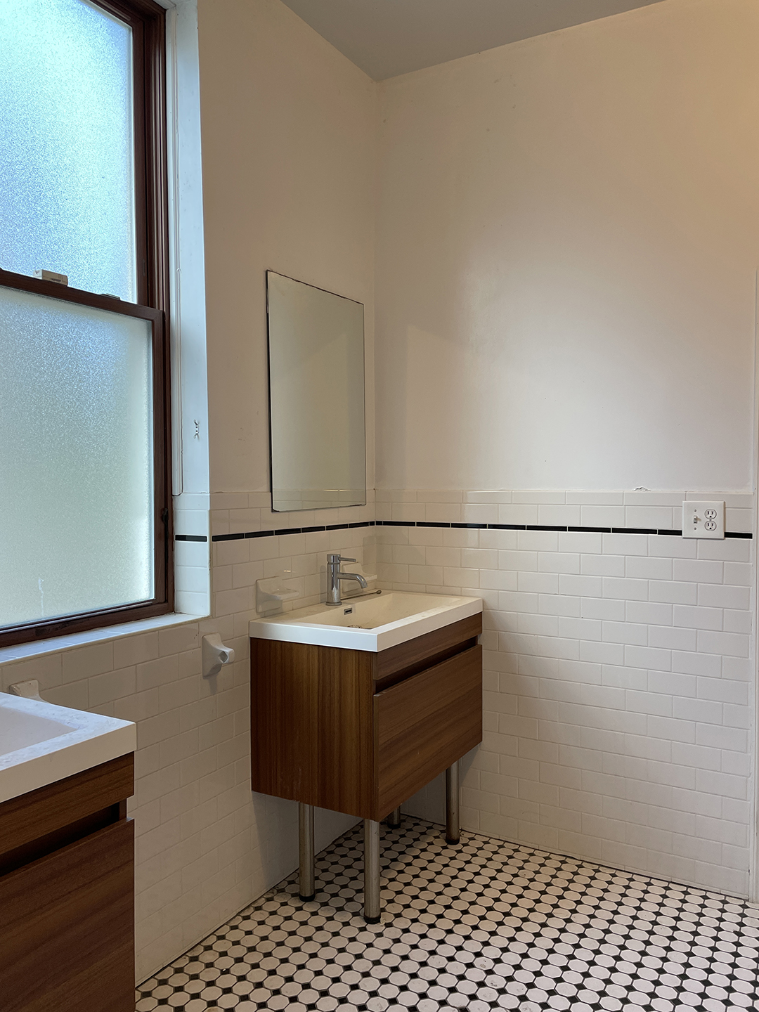
What Kemper describes as “the whole shebang” — that is, the dizzying array of surprises like asbestos in the roof and necessary facade repairs — now seems far, far away. Far enough away to make plans for the backyard, which is still a work in progress.